
Canva founders Cliff Obrecht, Melanie Perkins and Cameron Adams.
Ever wonder what the first pitch deck of a billion-dollar company looks like? Or how many iterations one has to go through before investors sit up and take notice? Canva co-founder Melanie Perkins shares her startup’s first attempts at wooing investors, and the things she learnt along the way.
We’ve had a very consistent vision for a long time, though the way we express that vision has changed dramatically over time. I thought it’d be fun to share with you the way our pitch deck has evolved over the years to illustrate this.
My pitch deck from 2008 where we were trying to sound inventor-y:

Source: supplied.
Here’s the (embarrassing) pitch deck that I presented to Bill [Tai] and Lars [Rasmussen] when I first went to San Francisco:
Fusion Books Pitch Deck 2011 by Melanie Perkins
In retrospect it was pretty terrible. I knew nothing about the norms of startup pitch decks, but had been told to include an ‘exit’ slide.
Another thing we had to start doing was speaking a little more American swagger. We had a lot of generous people giving us their advice, this exchange with Ash Fontana who went on to become an angel in Canva was particularly useful, he told us to include our revenue in our deck and I said:
I don’t think our revenue is hugely impressive at the moment as it will be $2m this year and just under $1m last year. We had 50,000 pages made on the system 2011/12 do you think this is a better stat to include?
He responded:
Include Revenue — those ($2M and 100% YoY growth) are awesome numbers. Very few startups ever reach that, as surprising as that may be. You really need to push that to credentialize yourselves as successful entrepreneurs.
We then went through a very awkward stage when we were trying to find a business name and for a short period of time settled on the name Canvas Chef.
I liked the idea that we gave users lots of high quality ingredients (beautiful stock photography, illustrations, fonts etc) and that users could throw them together like on a cooking show. I like visual metaphors a lot, but took it way too far in the deck below. While the name was incredibly dorky, if you can squint you can see that the concept was quite consistent all the way back here. Funny fact, I entered a pitch into a competition in Perth and we didn’t even make it through to the finals. So if you are entering competitions — don’t worry, they don’t necessarily account for a lot.
Canvas Chef by Melanie Perkins
We then put together the pitch deck below. Yes, in retrospect my straight-line revenue prediction looks absolutely absurd — but fortunately today we do actually have more revenue and more users than I had even at the top end here, and our growth has been exponential not linear.
Pitch Deck April 2012 by Melanie Perkins
We were also very concerned that people might steal our idea — hence writing ‘strictly confidential’ on the cover. Someone who reviewed our deck was pretty apt in his feedback:
In the valley, all angels/vcs will tell you that nothing they accept is confidential and they won’t sign an NDA either just because they hear ideas all the time and need to usually share this. If someone wants to share the deck, they will regardless.
I felt a bit embarrassed that I’d sent Bill an NDA not once, but twice. Maybe that was why he didn’t respond to those initial emails I’d sent.
In retrospect, our pitch deck was on point, except for our timeframes — I thought rebuilding the entirety of the design ecosystem would happen much more quickly than it has.
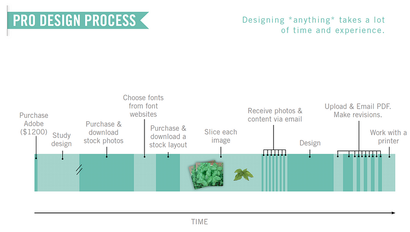
Every time we’d get a really tricky question from investors we’d iterate on our deck to put the hardest questions they asked right at the front of the deck. For example, a lot would say that they don’t understand the design industry, so we added this slide to explain the complicated process:
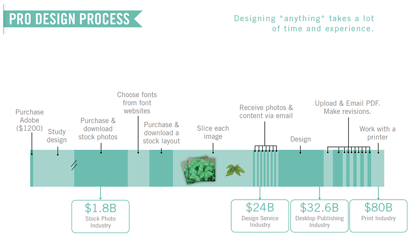
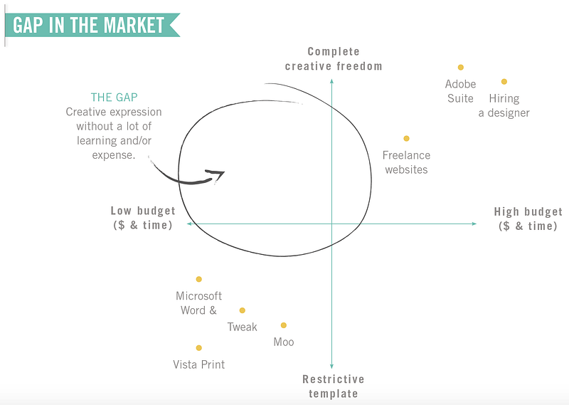
They couldn’t imagine there would be a ‘billion dollar opportunity’ in the market, so we added this slide:
Source: supplied.
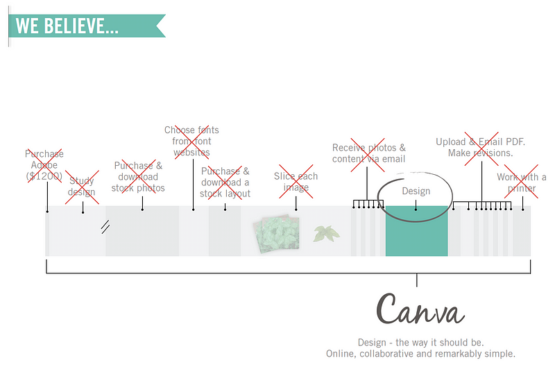
We wanted to take the entire design ecosystem integrate it into one page, and make it simple and accessible for everyone across the globe (no biggie):
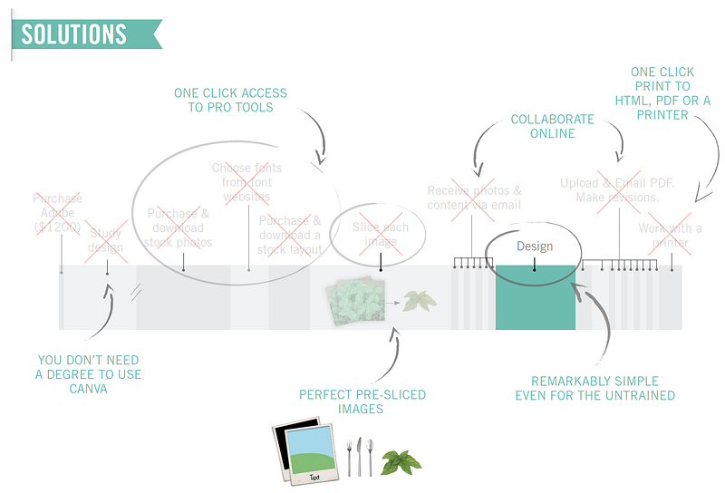
Our solution was going to feel like magic for our users:
In our early pitches they’d listen to our entire pitch and then at the end say ‘ah but that’s just the same as [some company]’. So we added this page towards the front so they’d stop asking us the same question:
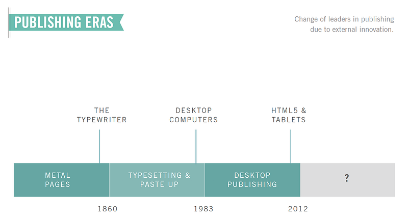
They’d say but what if a big company threw $500 million dollars at this problem, well, we felt like that’d be a pretty scary — but anyway, we added this page at the very start of our deck to help explain that in fact, no dominant player has survived between the huge tectonic shifts that had occurred in technology, each era a new market leader would emerge.
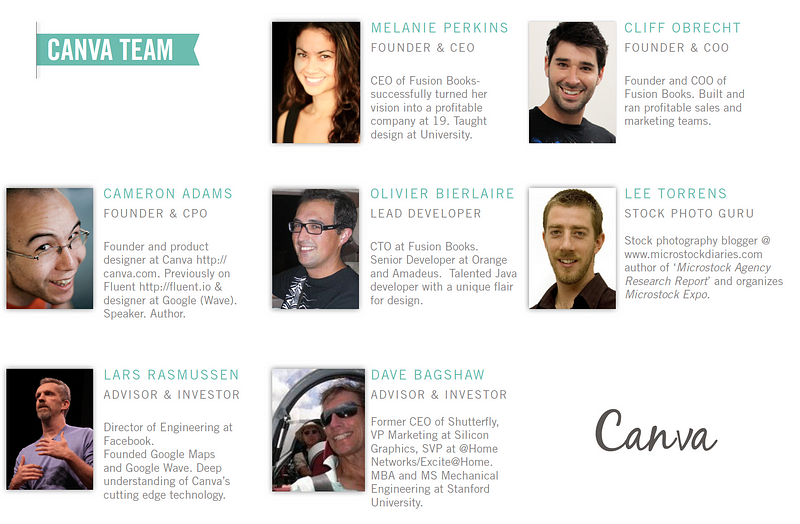
Our team slide even started to look a little more fleshed out. Even though three of the spots were filled by advisors at the time:
Finally we got a pitch together that we felt like it captured our vision. It was really long, but pre-answered so many of the investors’ trickiest questions, that by the end of it they had a lot less.
Canva Pitch Deck 2013 by Melanie Perkins
This post was first published on Medium and has been republished with permission.
ABOUT THE AUTHOR
Handpicked for you

Canva just mic-dropped 10 new AI tools, and they don’t cost extra

COMMENTS
SmartCompany is committed to hosting lively discussions. Help us keep the conversation useful, interesting and welcoming. We aim to publish comments quickly in the interest of promoting robust conversation, but we’re a small team and we deploy filters to protect against legal risk. Occasionally your comment may be held up while it is being reviewed, but we’re working as fast as we can to keep the conversation rolling.
The SmartCompany comment section is members-only content. Please subscribe to leave a comment.
The SmartCompany comment section is members-only content. Please login to leave a comment.